The P&L calendar is one of the most underrated tools a trader has. By showing your result day by day on a monthly grid, it turns an unreadable list of trades into an immediate picture: your good days in green, your bad days in red, and above all the hidden patterns you'd never see in a table. This guide explains what a P&L calendar is, what it reveals, and how to read it to improve. If the term itself is new, start with what P&L and today's P&L mean.
- The P&L calendar shows your result per day on a monthly grid, green or red.
- It reveals invisible patterns in a plain list of trades: days, weeks, consistency.
- An account is decided on few days: the calendar shows how much your extremes weigh.
- It makes consistency visible, the real marker of a trader who lasts.
Most traders look at their performance as an equity curve or a list of trades. These views are useful, but they crush an essential dimension: time. A curve doesn't tell you whether you always lose on Mondays, whether your Fridays are explosive, or whether a single catastrophic day sank your whole month. The P&L calendar puts time at the center.
By placing your result on a grid of days, the calendar surfaces behavioral regularities you never suspected. This guide shows you how to read it, what it reveals about your discipline, and why it should be part of your analysis routine.
What a P&L calendar is
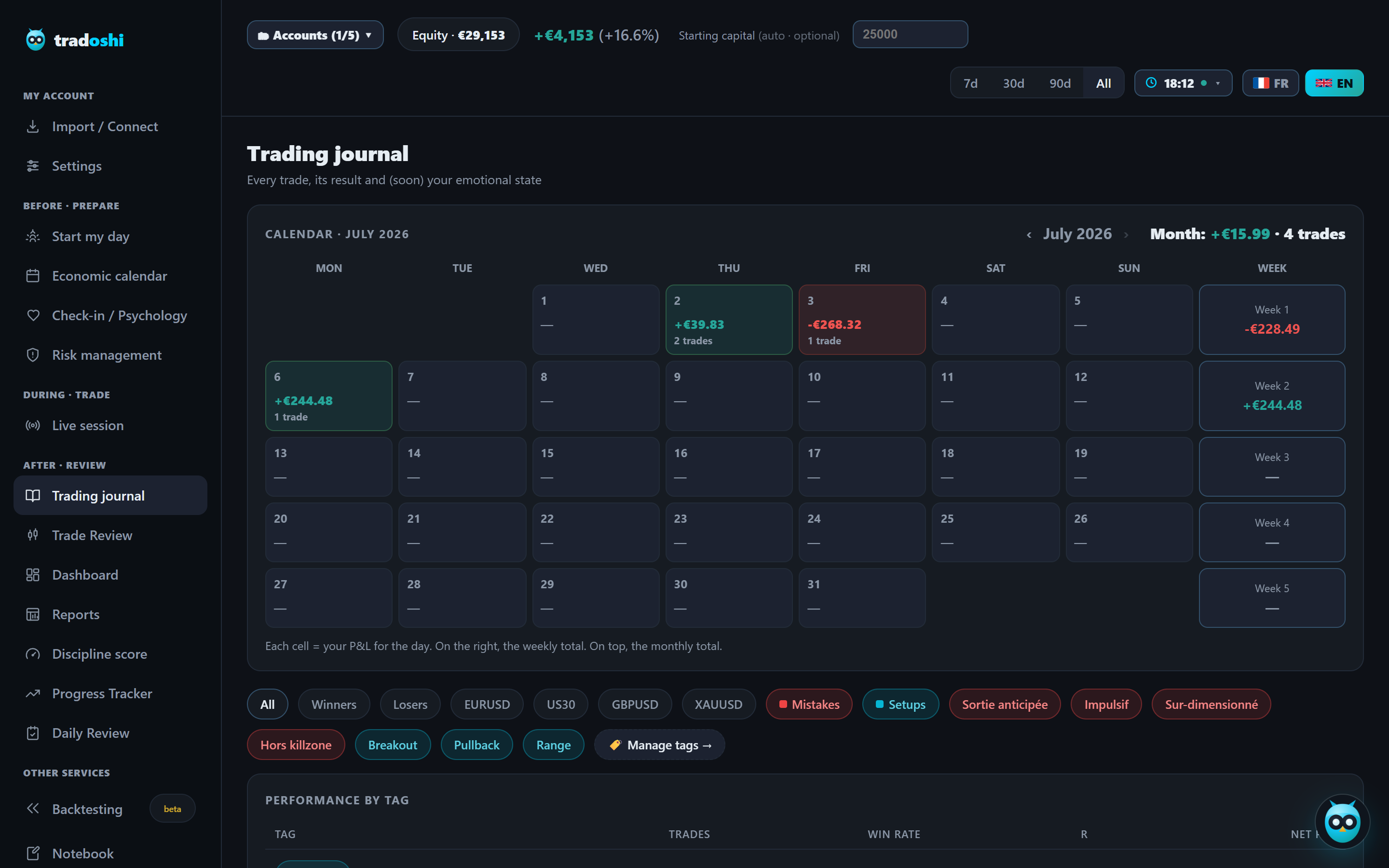
A P&L calendar is a monthly grid, like a classic calendar, where each cell corresponds to a trading day and shows your net result for that day. Winning days appear green, losing ones red, often with a color intensity proportional to the amount. At a glance, you see the texture of your month: mostly green, red, or an irregular patchwork.
This visual representation has a power that neither the equity curve nor the trade table possesses. The curve adds everything into a continuous line, the table drowns the information in rows. The calendar respects the trader's natural unit, the day, and lets you reason the way you actually live your activity: day after day.
Why the day is the right unit
In trading, the day is the fundamental decision unit. It's at the scale of a day that you decide to trade or not, that you keep or break your rules, that you tip into revenge trading or not. Analyzing your performance day by day brings you back to the unit where your behaviors actually play out, far more than at the level of the isolated trade or the whole month.
The day also carries emotions. Bad news, a short night, a big loss at the open: all of it colors an entire day and influences every trade that follows. The P&L calendar, by isolating each day, lets you connect your results to your state of the day, which is impossible when everything is aggregated into a single curve.
Spotting your problem days
The first use of the calendar is spotting regularities by day of the week. Many traders discover, by visualizing several months, that they systematically lose on certain days: poorly prepared Mondays, relaxed Fridays, or economic-news days. These patterns are nearly invisible in a list of trades, but jump out on a calendar.
Once the pattern is identified, the action is simple and powerful. If your Thursdays are systematically red, you can decide not to trade that day, or to cut your size, or to investigate what in your Thursday routine makes you lose. This optimization by removal, stopping what doesn't work, is often the easiest gain to obtain, and the calendar is what makes it visible.
Seeing the weight of your extreme days
The calendar reveals a truth most traders ignore: their performance often rests on a handful of days. One or two exceptionally green days can carry a whole month, and a single catastrophically red day can erase weeks of patient work. Seeing these extremes on a grid changes how you think about your risk.
An entire month of discipline can be erased by a single day where you lost control. The P&L calendar makes this risk visible, and therefore manageable.
This realization has a direct consequence: protecting your account means above all avoiding catastrophic days. A trader with no extreme red day, even with modest gains, builds a far more solid account than a trader with occasional big gains but regular collapses. The calendar pushes you to value consistency and hunt down your blow-up days.
Measuring your consistency
Beyond individual days, the calendar gives an immediate read of your consistency. A mostly green grid with similar amounts tells the story of a steady trader whose edge expresses itself day after day. A grid made of a few big greens and many reds tells the story of a trader who depends on rare shots, a far more fragile profile.
Consistency is the real marker of a trader who lasts, and it's precisely what the calendar makes visible better than any other tool. A healthy goal isn't to have exceptional days, but to have few red days and many small green ones. The calendar shows you where you stand on this axis, and gives you a concrete target: reduce variance, not maximize peaks.
The calendar as a mirror of discipline
The P&L calendar is also a formidable mirror of discipline, especially when enriched with behavioral information. By crossing each day with your emotional state, your rules kept or broken, or economic announcements, you turn a grid of results into a grid of causes. You no longer just see when you lost, but why.
That's where the calendar takes on its full value: it links your performance to your behavior. A red day becomes far more instructive when you know it coincided with a degraded emotional state, a losing streak or a high-impact news day. The calendar stops being a mere report and becomes a diagnostic tool, telling you which behaviors to work on.
Reading your calendar step by step
Reading a P&L calendar follows a natural progression, from the widest view down to the most precise. Start with the overall shape of the month: is the grid mostly green, mostly red, or an irregular mix of both? This first impression gives you the general tone before you dig into detail. Don't try to explain anything yet, just observe the overall texture.
Next, break your view down by week. Compare the first week of the month to the last: did your energy and discipline stay constant, or did they erode as the days went on? Many traders discover they trade better early in the week, when they're rested, and degrade toward Thursday or Friday, under the weight of accumulated fatigue or overconfidence after a strong start.
Finally, isolate the days that stand out, in either direction. An abnormally green or abnormally red day deserves a click to understand exactly what happened that day. It's this third step, the targeted investigation of extremes, that turns a simple visual observation into a real diagnosis.
Common mistakes in reading the calendar
The first mistake is over-interpreting a single red day as a sign of overall failure. An isolated red cell in an otherwise healthy grid is often nothing more than the normal statistical noise of any system, even an excellent one. Panicking over one isolated day, and reacting by changing your rules, is a way of letting emotion steer your learning.
The second mistake is the opposite: ignoring the context behind a cell. A red day caused by an exceptional macro news event, a technical outage, or an unrelated personal disruption doesn't carry the same diagnostic weight as a red day caused by a disciplined slip. Without annotating context, you risk drawing false conclusions about days that actually have nothing to do with your method.
The third mistake is comparing months with a different number of trading days. A month where you traded fifteen days isn't directly comparable to a month where you traded five. Always look at the density of green and red days relative to the number of days actually traded, not just the dominant color of the grid.
A worked example to grasp the weight of extremes
Imagine a trader who traded twenty days in a month. Seventeen days show a small gain or a small loss, between -100 and +150, the very picture of consistency. But two days stand out: one at +900 and one at -1,100. On the calendar, these two cells jump out immediately amid the pale green and red of the other days.
Without those two extreme days, this trader would close the month around +400, carried by a steady accumulation of small gains, exactly the profile every trader should aim for. With them, the month shows +200, an honorable result that hides a more fragile reality: a single bad day would have been enough to tip the whole month into the red. This kind of reading, invisible on a plain equity curve, is exactly what the calendar makes immediate.
Calendar and position size
The P&L calendar becomes even more meaningful when read alongside your position size. A red day with 0.5% of the account at risk doesn't carry the same weight as a red day with 3% at risk. Many traders look at the amount in currency without asking what percentage of their capital it represents, which completely distorts the reading of the extremes.
By crossing each cell of the calendar with the risk actually taken that day, you often discover that your worst days aren't just bad-luck days, but days where you, consciously or not, increased your position size. This cross-reference turns the calendar from a mere results tracker into a risk-control tool.
Looking at your calendar across several months
A single month of calendar tells a story, but several months placed side by side tell a much richer one. By comparing your grids month after month, you see whether your consistency is improving over time, whether certain months are structurally harder for you (vacation periods, market seasonality, personal workload), or whether the same pattern of problem days keeps recurring.
This longitudinal reading is what separates a trader who's genuinely improving from one who's stagnating while telling themselves they're improving. If your grids become, month after month, greener and less contrasted, you have visual, objective proof of your progress, far more convincing than a general impression or a single good month taken in isolation.
The calendar against a daily loss limit
For a trader operating under a strict daily loss limit, as is the case on a prop firm account, the P&L calendar changes nature: it no longer just tells the story of the past, it becomes a real-time monitoring tool. Every colored cell is then mentally compared to a precise threshold, and the goal is no longer just finishing the month green, but never touching the limit that ends the account.
In this context, reading the calendar narrows around a single question: how often do my red days come close to my limit? A trader who regularly skirts their threshold, even without ever crossing it, is taking on a structural risk that the calendar reveals long before the account actually blows up. Seeing this recurring proximity on the grid is often the trigger that pushes a trader to cut position size before the limit becomes a real problem rather than an abstract hypothesis.
How Tradoshi displays your P&L calendar
Tradoshi builds your P&L calendar automatically from your synced trades, with the detail of each day accessible on click. You see your result per day, your recurring patterns, and you can link each day to your emotional state and your rule adherence.
- Automatic monthly grid with your P&L per day, green or red, navigable month by month.
- Detail on click for a day: the day's trades, result, and context.
- Crossed with your discipline and emotions to understand the why of each day.
- A risk calendar in complement, showing the % of capital risked each day.
Frequently asked questions
What is a P&L calendar in trading?
It's a monthly grid where each cell corresponds to a trading day and shows your net result for that day, green for gains and red for losses. It turns an unreadable list of trades into an immediate picture of your performance over time, and reveals weekday patterns invisible otherwise.
What is a P&L calendar for?
To spot regularities you wouldn't see in a list of trades: weekdays where you systematically lose, the weight of your extreme days, and the overall consistency of your performance. It lets you optimize by removal (stop trading the days that make you lose) and link your results to your behavior.
Why analyze performance by day?
Because the day is the trader's natural unit: it's at that scale that you decide to trade, keep or break your rules, and emotions color your decisions. Analyzing by day brings you back to where your behaviors actually play out, far more than at the level of the isolated trade or the whole month.
What does a P&L calendar reveal about my risk?
It shows how much your performance depends on a few extreme days. Often, one or two big green days carry a whole month, and a single catastrophic red day can erase weeks. Seeing this pushes you to value consistency and hunt down your blow-up days, because protecting your account means first avoiding catastrophic days.
P&L calendar or equity curve?
Both are complementary. The equity curve shows your cumulative trajectory and drawdowns; the calendar puts time at the center and reveals patterns by day. The curve answers 'where I stand', the calendar 'when and why I win or lose'. A good journal shows both.
How do I correctly read my P&L calendar?
Go from the widest view to the most precise: first look at the overall texture of the month, then compare your weeks against each other, then isolate the extreme days to understand what happened. Avoid over-interpreting a single isolated red day, which is often normal noise, and discount days distorted by something unrelated to your method.
Should I cross the P&L calendar with position size?
Yes, it's one of the most useful cross-references. A red day with 0.5% of the account at risk doesn't carry the same weight as a red day with 3% at risk. Many traders discover their worst days coincide with days where they, consciously or not, had increased their position size.