Supply and demand zones are among the most widely taught concepts in discretionary technical analysis, and among the most misunderstood. The basic idea is simple: certain price levels once absorbed a sharp imbalance between buyers and sellers, and might do so again. The trick is identifying them correctly, avoiding the classic traps that make the method as subjective as it is risky, and above all, honestly measuring whether it works for you. This guide explains the mechanics of the concept, without claiming it's a guaranteed edge.
- A supply or demand zone marks a level where supply or demand once overwhelmed the market, right before a strong move.
- Not all zones are equal: a 'fresh' zone (never retested) statistically carries more weight than a zone already retested several times.
- It's not plain support/resistance: a zone covers a price range born from an imbalance, not a single line.
- It's a discretionary, subjective method: two traders rarely draw the same zones, which makes journaling essential to know if it actually works for you.
If you've ever opened a chart and heard about 'zones where price will react', you've run into the supply and demand concept. The idea comes from a simple intuition borrowed from classical economics: when supply vastly outweighs demand at a given price level, or the reverse, that imbalance leaves a mark on the chart, in the form of a specific price zone rather than a single line. If price returns to that zone later, it might find the same imbalance and react the same way.
This guide unpacks the concept in depth: what a zone actually is, how to identify one on a chart, the notion of imbalance that often comes with it, how it differs from classic support and resistance, the mistakes that make the method ineffective in practice, and why, as a fundamentally discretionary method, it demands a level of tracking rigor that many traders skip.
The basic concept
A supply zone is a price level where, in the past, selling pressure clearly overwhelmed buying pressure, causing a fast drop in price. A demand zone is its mirror: a level where buying pressure clearly overwhelmed selling pressure, causing a fast rise. The idea behind the method is that this imbalance leaves an identifiable mark, and that if price returns to that same zone later, part of the original imbalance may not have been fully absorbed, and could show up again.
This reasoning borrows a supply-and-demand intuition from classical economics and applies it to financial markets. It isn't a physical law of the market, it's a mental model that many discretionary traders use to structure how they read a chart. Understanding that from the start keeps you from treating zones as scientific certainty: it's one reading tool among others, no more and no less reliable by nature.
How to identify a zone on a chart
A zone builds in two visible steps on a chart. First, a 'base' phase: price moves sideways in a tight range, a sign of temporary balance between buyers and sellers. Then, a sharp departure: price leaves that base with a candle or series of candles notably larger than average, in a single direction, with little pullback. It's this combination, base then a clean departure, that defines the zone: the base itself becomes the supply or demand zone.
The quality of the departure matters as much as the base. A weak departure, with long wicks and heavy overlap between candles, signals a weak imbalance and therefore an unreliable zone. A clean departure, with candles that advance with little overlap, signals a strong imbalance. It's this dynamic of the move leaving the base, more than the base itself, that gives a zone its credibility within the method.
Fresh zones versus tested zones
A central distinction in the method separates a fresh zone, never retested since it formed, from a zone already tested once or several times. The intuition behind this distinction is simple: each pass of price through the zone is assumed to 'consume' part of the leftover orders sitting there (stops, unfilled limit orders, positions to average). The more a zone has been retested, the more it's assumed to have 'emptied out', and the weaker the expected reaction on the next pass.
| Zone state | Typical reading |
|---|---|
| Fresh (never retested) | Potentially stronger reaction |
| Tested once | Reaction judged more uncertain |
| Tested several times | Zone considered weakened, possibly abandoned |
| Broken through with force | Zone invalidated: the imbalance was absorbed |
This logic remains a heuristic, not a universally measurable guarantee. It explains why many traders who use the method focus almost exclusively on fresh zones and deliberately ignore ones already retested several times, seen as too 'worn out' to offer an interesting risk-to-reward setup.
The idea of imbalance or inefficiency
The term 'imbalance' (or inefficiency) often comes up alongside supply and demand zones. Informally, it describes the portions of a chart where price moved so fast in one direction that trading between buyers and sellers at those levels was minimal, leaving a kind of 'gap' in the normal structure of exchanges. The idea, again informal and not standardized across traders, is that the market sometimes tends to come back and fill those fast-passage zones before continuing its move.
There is no single, universally accepted technical definition of imbalance: every method, every teacher, every automated detection tool proposes its own variant, sometimes with very different criteria. It's a concept to handle carefully, treating it as a piece of context that nuances the reading of a zone, not as a mechanical, infallible rule on its own.
How it differs from classic support and resistance
Traditional support and resistance are most often drawn as horizontal lines, at levels where price bounced or stalled multiple times in the past. A supply or demand zone is drawn differently: it covers a price range (the entire base, from the high to the low of the consolidation), and crucially, it can be valid even if the level has never been retested before. That's a major methodological difference: support/resistance builds on observed repetition, a supply/demand zone builds on the intensity of a single departure move.
In practice, the two notions often overlap: a solid demand zone frequently coincides with a former support level. But the logic behind them differs, and confusing the two leads to poorly drawn zones, often too thin or, conversely, absurdly wide, that no longer resemble the original concept.
The role of higher timeframe context
A zone drawn in isolation, without looking at the bigger picture, loses much of its relevance. A demand zone on a 5-minute chart sitting right inside a major supply zone on the daily chart sends a contradictory signal: the bigger picture can dominate and make the small zone ineffective. The method, in its more rigorous form, always relies on a top-down reading: identify significant zones on higher timeframes first, then refine the entry on lower timeframes, in line with that context.
Ignoring higher timeframes is one of the most common reasons a zone that 'looked clean' on a small interval fails in practice. Price never reacts in a vacuum: a zone that goes against a clear underlying trend, or that sits in the middle of nowhere on wider timeframes, statistically has fewer reasons to produce a clean reaction.
An illustrative example
Imagine a chart where price moves in a tight range for several hours between 100 and 101, then departs in a series of wide candles up to 108 in a short time, with no meaningful pullback. The base between 100 and 101 becomes a potential demand zone. Three days later, price comes back to touch that zone for the first time: it's a fresh zone, aligned with the underlying move seen on a higher timeframe. That's exactly the kind of setup the method treats as highest quality.
Now imagine the same zone, but retested a fourth time two weeks later, having already reacted twice with less and less strength each time, while the higher timeframe has since turned clearly bearish. That's a far more fragile setup: the zone is worn out, the underlying context has changed, and most traders following the method would simply have skipped it. This contrast illustrates why not all zones are equal, even when drawn at the same price level.
The most common mistakes
The first mistake, very common among beginners to the method, is drawing zones far too wide, sweeping in several candles that have nothing to do with the actual base of the move. An overly wide zone creates the illusion of always being right (price 'always touches the zone', given its size), but it makes the risk tied to the trade completely disproportionate, with a stop placed far too wide to be defensible.
The second mistake is wanting to trade every zone encountered, with no hierarchy or selectivity. A chart quickly fills up with dozens of them once you start drawing across multiple timeframes. Trading all of them, regardless of freshness, underlying context or quality of the departure, means multiplying low statistical quality entries. The third mistake, already mentioned, is ignoring higher timeframe context and treating each zone as an isolated signal, independent of the rest of the chart.
A discretionary method, so measure it
The single most important thing to understand about supply and demand zones is their fundamentally discretionary nature. Two traders trained by the same school, looking at the same chart, almost never draw perfectly identical zones: the width, the exact starting point, the assessment of 'freshness' or departure quality all vary from one eye to another. It isn't an automatically computed indicator or a reproducible mathematical formula, it's a reading, with all the variability that implies.
That subjectivity isn't a problem in itself, but it has a direct consequence: no one can tell you, based on a general study, whether supply and demand zones 'work', because how each trader draws and filters them radically changes the outcomes. The only valid answer is individual, and it requires tracking your own zone-based trades, over time, to objectively know whether your version of the method gives you an edge or not.
How Tradoshi helps
Whatever your strategy, supply and demand, order flow, moving averages or any other approach, the question that ultimately matters is always the same: does what you're doing produce results over time? Tradoshi doesn't take sides for one method over another: it's the tracking and discipline layer that turns a discretionary practice into usable data, whatever setup you actually trade.
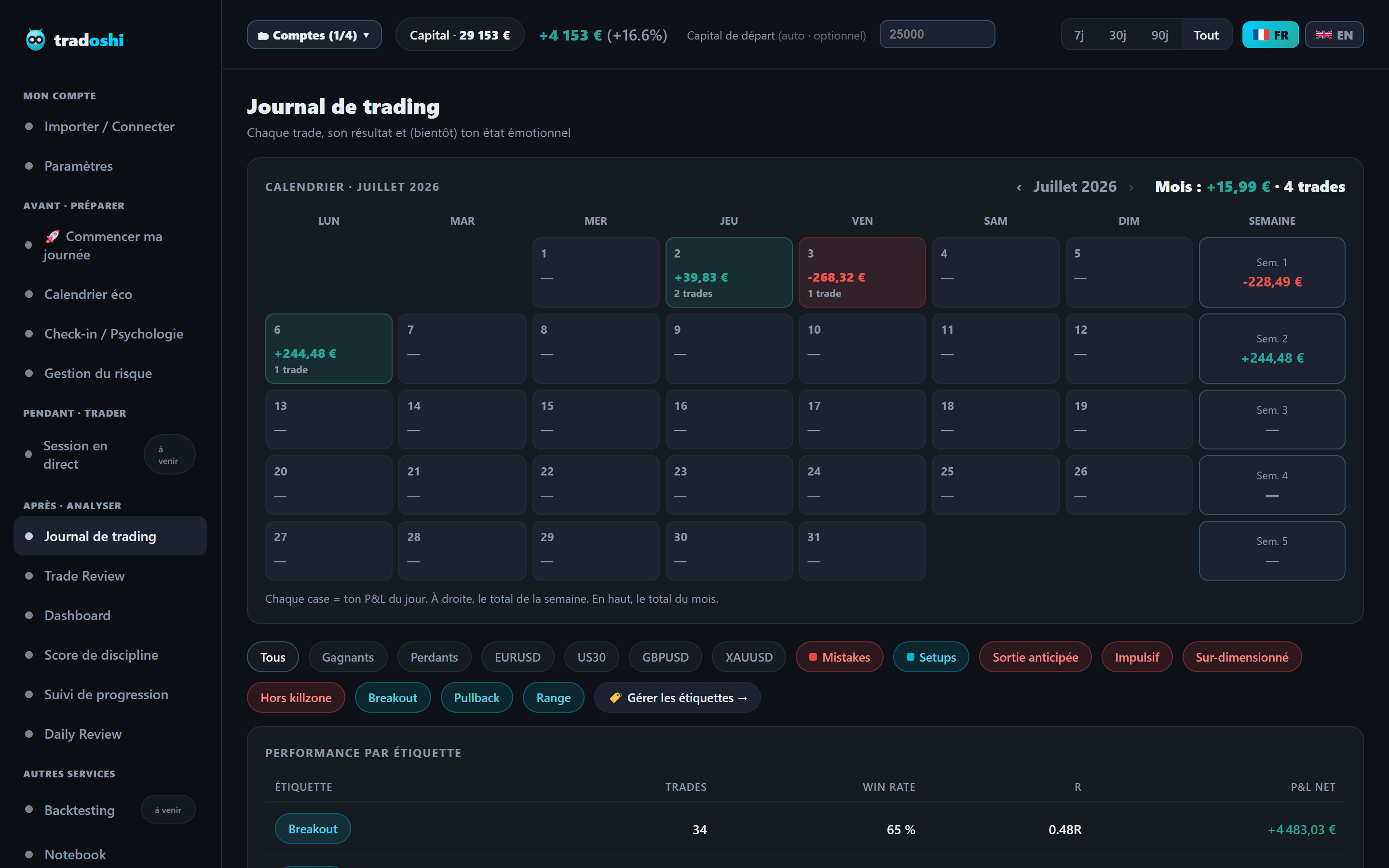
By tagging every trade with the setup used, you can isolate your fresh-zone trades from your tested-zone trades, compare their win rate, average R-multiple and profit factor, and know with numbers, not a gut feeling, whether your zone reading actually serves you or quietly costs you money.
- Per-trade setup tags: isolate your 'fresh zone' trades from your 'tested zone' trades to compare results.
- Stats by tag: win rate, average R-multiple and profit factor computed automatically for each setup type.
- Detailed journal: attach your zone screenshot and reasoning to every trade, to review yourself with a clear head.
- Market replay (Dukascopy): revisit price history to verify after the fact how a zone actually reacted.
Frequently asked questions
What is a supply and demand zone in trading?
A supply zone marks a level where supply once clearly overwhelmed demand, causing a fast price drop. A demand zone is the opposite: a level where demand overwhelmed supply, causing a fast rise. The idea is that this imbalance leaves a mark, and price might react again when it comes back to that same price range.
How do you draw a zone on a chart?
Look for a base phase, price moving sideways in a tight range, followed by a sharp departure with wide candles and little overlap in one direction. The base itself, from the high to the low of the consolidation, becomes the zone. The quality of the departure (clean and fast rather than weak) gives the zone its credibility.
What's the difference between a fresh zone and a tested zone?
A fresh zone has never been retested since it formed, the idea being that leftover orders are still fully present there. A tested zone has already been retouched once or several times, and is assumed to have partially 'emptied out' with each pass, weakening the expected reaction over successive tests.
How does it differ from classic support and resistance?
Classic support/resistance is drawn as a horizontal line, at levels tested multiple times. A supply/demand zone covers a price range (the entire base) and can be valid on the very first test, because it's built on the intensity of a single departure move rather than on observed repetition.
Do supply and demand zones actually work?
It's a fundamentally discretionary method: two traders rarely draw the exact same zones, which makes a general, universal answer impossible. The only reliable way to know if it works for you is tracking your own trades by setup, over time, with rigorous journaling.
What are the most common mistakes with this method?
Drawing zones too wide, which makes risk disproportionate, wanting to trade every zone encountered with no hierarchy or selectivity, and ignoring higher timeframe context by treating each zone as an isolated signal separate from the rest of the chart.