 By Benjamin Roure L'Hermitte
In trading, supply and demand is the idea that price turns where one side once overwhelmed the other: a supply zone is a price range where sellers took over just before a sharp drop, a demand zone a range where buyers took over just before a sharp rise. Supply and demand zones are a staple of discretionary technical analysis, and they come from trading practice, not from research. The trick is identifying them correctly, avoiding the classic traps that make the method as subjective as it is risky, and above all, honestly measuring whether it works for you. This guide explains the mechanics of the concept, without claiming it's a guaranteed edge.
- A supply or demand zone marks a level where supply or demand once overwhelmed the market, right before a strong move.
- Not all zones are equal: the method gives a 'fresh' zone (never retested) more weight than a zone already retested several times, though no published study measures it.
- It's not plain support/resistance: a zone covers a price range born from an imbalance, not a single line.
- It's a discretionary, subjective method: two traders rarely draw the same zones, which makes journaling essential to know if it actually works for you.
If you've ever opened a chart and heard about 'zones where price will react', you've run into the supply and demand concept. Every supply-demand zone rests on the same mechanism, and on most charts a demand zone and supply zone come as a pair: one below price, where buyers stepped in, one above, where sellers did. The idea comes from a simple intuition borrowed from classical economics: when supply vastly outweighs demand at a given price level, or the reverse, that imbalance leaves a mark on the chart, in the form of a specific price zone rather than a single line. If price returns to that zone later, it might find the same imbalance and react the same way. Demand and supply zone trading is the practice built on that bet: mark the zones in advance, wait for price to come back, and act only if it reacts.
This guide unpacks the concept in depth: what a zone actually is, how to identify one on a chart, the notion of imbalance that often comes with it, how it differs from classic support and resistance, the mistakes that make the method ineffective in practice, and why, as a fundamentally discretionary method, it demands a level of tracking rigor that many traders skip.
The basic concept
A supply zone is a price level where, in the past, selling pressure clearly overwhelmed buying pressure, causing a fast drop in price. A demand zone is its mirror: a level where buying pressure clearly overwhelmed selling pressure, causing a fast rise. The idea behind the method is that this imbalance leaves an identifiable mark, and that if price returns to that same zone later, part of the original imbalance may not have been fully absorbed, and could show up again.
This reasoning borrows a supply-and-demand intuition from classical economics and applies it to financial markets. Research does describe that mechanism at the level of the order book: in 'How markets slowly digest changes in supply and demand', by Bouchaud, Farmer and Lillo, the liquidity visible at any moment is extremely low, so a large order to buy or sell can only be traded incrementally, over periods as long as months. That makes a lasting buying or selling interest plausible. It does not say that a zone drawn on a chart locates it: the zone method comes from trading practice, not from that work. So it isn't a physical law of the market, it's a mental model that many discretionary traders use to structure how they read a chart: one reading tool among others, not a scientific certainty.
This supply-and-demand reading is older than the vocabulary of zones: Richard Wyckoff was already comparing the market to a pair of scales in a book from 1910, and his method adds volume to price. The lesson on the Wyckoff method and VSA says what he wrote himself, what his successors added, and what no study measures.
How to identify a zone on a chart
A zone builds in two visible steps on a chart. First, a 'base' phase: price moves sideways in a tight range, a sign of temporary balance between buyers and sellers. Then, a sharp departure: price leaves that base with a candle or series of candles notably larger than average, in a single direction, with little pullback. It's this combination, base then a clean departure, that defines the zone: the base itself becomes the supply or demand zone.
The quality of the departure matters as much as the base. A weak departure, with long wicks and heavy overlap between candles, signals a weak imbalance and therefore an unreliable zone. A clean departure, with candles that advance with little overlap, signals a strong imbalance. It's this dynamic of the move leaving the base, more than the base itself, that gives a zone its credibility within the method.
Fresh zones versus tested zones
A central distinction in the method separates a fresh zone, never retested since it formed, from a zone already tested once or several times. The intuition behind this distinction is simple: each pass of price through the zone is assumed to 'consume' part of the leftover orders sitting there (stops, unfilled limit orders, positions to average). The more a zone has been retested, the more it's assumed to have 'emptied out', and the weaker the expected reaction on the next pass.
| Zone state | Typical reading |
|---|---|
| Fresh (never retested) | Potentially stronger reaction |
| Tested once | Reaction judged more uncertain |
| Tested several times | Zone considered weakened, possibly abandoned |
| Broken through with force | Zone invalidated: the imbalance was absorbed |
This logic remains a heuristic, not a universally measurable guarantee: to our knowledge, no published source gives the success rate of a fresh zone, or of a zone already tested. The closest evidence concerns levels, not zones: in the foreign exchange market, a study by Carol Osler for the Federal Reserve Bank of New York (Staff Report No. 125), run on the stop-loss and take-profit orders of a large dealing bank, finds them strongly clustered at round numbers, which are often used as support and resistance levels. Orders do pile up at certain prices, then, but nothing in it says a consolidation base is one of them. The heuristic explains why the method recommends focusing on fresh zones and setting aside ones already retested several times, seen as too 'worn out' to offer an interesting risk-to-reward setup.
The idea of imbalance or inefficiency
The term 'imbalance' (or inefficiency) often comes up alongside supply and demand zones. Informally, it describes the portions of a chart where price moved so fast in one direction that trading between buyers and sellers at those levels was minimal, leaving a kind of 'gap' in the normal structure of exchanges. The idea, again informal and not standardized across traders, is that the market sometimes tends to come back and fill those fast-passage zones before continuing its move.
There is no single, universally accepted technical definition of imbalance: every method, every teacher, every automated detection tool proposes its own variant, sometimes with very different criteria. It's a concept to handle carefully, treating it as a piece of context that nuances the reading of a zone, not as a mechanical, infallible rule on its own.
The ICT school systematised this vocabulary by naming each case. The hole left by a fast pass becomes a fair value gap. The last opposing candle before the departure becomes an order block, and when price cuts through it instead of reacting, the zone switches sides and takes the name of breaker block: an order block that was not respected, read the other way round. These are refinements of the same supply and demand reasoning, not competing concepts.
How it differs from classic support and resistance
Support and resistance are defined by supply and demand too: for StockCharts' ChartSchool, on its support and resistance page, support is the price level at which demand is thought to be strong enough to prevent the price from declining further, and resistance the level at which selling is thought to be strong enough to prevent it from rising further. The same page actually advises drawing zones rather than exact levels, because technical analysis is not an exact science. So the real difference is not the width of the drawing, it is the criterion. Support or resistance is spotted at levels where price bounced or stalled multiple times in the past. A supply or demand zone covers the entire base, from the high to the low of the consolidation, and can be kept even if the level has never been retested before: support/resistance builds on observed repetition, a supply/demand zone builds on the intensity of a single departure move.
In practice, the two notions overlap: a demand zone can coincide with a former support level. They also share the same fate once crossed. According to the same ChartSchool page, broken support can turn into resistance and vice versa, and a zone price has cut through is reread the same way, from the other side. Price coming back to a level it has crossed is not automatic, though: on US stocks since 2000, Thomas Bulkowski's Throwbacks page on ThePatternSite counts it after 58% of 10,305 chart patterns with upward breakouts. That count covers chart patterns, not zones, and the article on break and retest goes through it. But the logic behind the two notions differs, and confusing them leads to poorly drawn zones, too thin or, conversely, absurdly wide, that no longer resemble the original concept.
A third family of levels comes neither from past bounces nor from bases: pivot points are calculated before the open, from the previous day's high, low and close. The lesson on pivot points works that calculation by hand and shows that the result changes with the variant and with the platform.
The role of higher timeframe context
A zone drawn in isolation, without looking at the bigger picture, loses much of its relevance. A demand zone on a 5-minute chart sitting right inside a major supply zone on the daily chart sends a contradictory signal: the bigger picture can dominate and make the small zone ineffective. The method, in its more rigorous form, always relies on a top-down reading: identify significant zones on higher timeframes first, then refine the entry on lower timeframes, in line with that context.
Ignoring higher timeframes is, within the method, the usual explanation for a zone that 'looked clean' on a small interval and failed in practice. Price never reacts in a vacuum: a zone that goes against a clear underlying trend, or that sits in the middle of nowhere on wider timeframes, has fewer reasons to produce a clean reaction. That is a common-sense argument, not a measurement, and your own trades are where to check it.
An illustrative example
Imagine a chart where price moves in a tight range for several hours between 100 and 101, then departs in a series of wide candles up to 108 in a short time, with no meaningful pullback. The base between 100 and 101 becomes a potential demand zone. Three days later, price comes back to touch that zone for the first time: it's a fresh zone, aligned with the underlying move seen on a higher timeframe. That's exactly the kind of setup the method treats as highest quality.
Now imagine the same zone, but retested a fourth time two weeks later, having already reacted twice with less and less strength each time, while the higher timeframe has since turned clearly bearish. That's a far more fragile setup: the zone is worn out, the underlying context has changed, and most traders following the method would simply have skipped it. This contrast illustrates why not all zones are equal, even when drawn at the same price level.
The most common mistakes
The first mistake, a classic when you discover the method, is drawing zones far too wide, sweeping in several candles that have nothing to do with the actual base of the move. An overly wide zone creates the illusion of always being right (price 'always touches the zone', given its size), but it makes the risk tied to the trade completely disproportionate, with a stop placed far too wide to be defensible.
The second mistake is wanting to trade every zone encountered, with no hierarchy or selectivity. A chart quickly fills up with dozens of them once you start drawing across multiple timeframes. Trading all of them, regardless of freshness, underlying context or quality of the departure, means multiplying entries the method itself rates as poor. The third mistake, already mentioned, is ignoring higher timeframe context and treating each zone as an isolated signal, independent of the rest of the chart.
A discretionary method, so measure it
The single most important thing to understand about supply and demand zones is their fundamentally discretionary nature. Two traders trained by the same school, looking at the same chart, almost never draw perfectly identical zones: the width, the exact starting point, the assessment of 'freshness' or departure quality all vary from one eye to another. It isn't an automatically computed indicator or a reproducible mathematical formula, it's a reading, with all the variability that implies.
That subjectivity is not specific to zones, and it isn't a problem in itself. The study by Lo, Mamaysky and Wang published in 2000 in the Journal of Finance opens on that very point: the presence of geometric shapes in price charts is often in the eyes of the beholder. To get around it, the authors had an algorithm recognize chart patterns on US stocks from 1962 to 1996, and conclude that several of them provide incremental information and may have some practical value. Their test covers patterns such as the head and shoulders or the double bottom, not supply and demand zones, for which we found no comparable measurement. The consequence is direct: no one can tell you, based on a general study, whether supply and demand zones 'work', because how each trader draws and filters them changes the outcomes. The only valid answer is individual, and it requires tracking your own zone-based trades, over time, to objectively know whether your version of the method gives you an edge or not.
How Tradoshi helps
Whatever your strategy, supply and demand, order flow, moving averages or any other approach, the question that ultimately matters is always the same: does what you're doing produce results over time? Tradoshi doesn't take sides for one method over another: it's the tracking and discipline layer that turns a discretionary practice into usable data, whatever setup you actually trade.
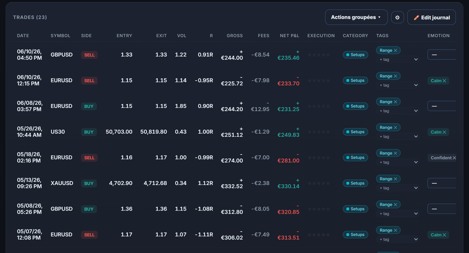
By tagging every trade with the setup used, you can isolate your fresh-zone trades from your tested-zone trades, compare their win rate, average R-multiple and profit factor, and know with numbers, not a gut feeling, whether your zone reading actually serves you or quietly costs you money.
- Per-trade setup tags: isolate your 'fresh zone' trades from your 'tested zone' trades to compare results.
- Stats by tag: win rate, average R-multiple and profit factor computed automatically for each setup type.
- Detailed journal: attach your zone screenshot and reasoning to every trade, to review yourself with a clear head.
- Market replay (Dukascopy): revisit price history to verify after the fact how a zone actually reacted.
Market structure, breaks and liquidity: reading what holds and what gives
Understanding market structure comes down to knowing whether price is making higher highs and higher lows, the reverse, or neither. Trading market structure is nothing more exotic than acting on that sequence. A break of structure is the moment the sequence fails: in an uptrend, the first higher low that does not hold. When the break is followed by highs and lows in the opposite direction, it becomes a market structure shift, the event many entries wait for: a demand zone that forms right after such a shift has the new sequence behind it, one that forms against it does not.
Liquidity is the other half. Stops pile up above highs and below lows, and price often goes to collect them before leaving in the opposite direction. Liquidity strategies consist of waiting for that sweep rather than being caught in it, which is why a zone sitting just beyond an obvious high or low deserves more attention than one in the middle of a range. ICT vocabulary calls the midpoint of that range equilibrium, and uses it as a filter: demand zones below it and supply zones above it leave the trade more room to run.
Volume profile completes the reading by showing where the market actually traded. A P-shaped volume profile, with most of the volume stacked in the upper part of the range, shows where trading concentrated after a fast rise, and low volume areas mark the corridors price crossed quickly, which is the same footprint a supply or demand zone is drawn on. A zone that lines up with a low volume area rests on two independent readings rather than one.
These tools hold across horizons and instruments, and none of them replaces the zone: they tell you which zones deserve a place on the chart. ICT concepts are best read the same way, as a vocabulary for structure and liquidity rather than a separate system.
Frequently asked questions
What is a supply and demand zone in trading?
A supply zone marks a level where supply once clearly overwhelmed demand, causing a fast price drop. A demand zone is the opposite: a level where demand overwhelmed supply, causing a fast rise. The idea is that this imbalance leaves a mark, and price might react again when it comes back to that same price range.
How do you draw a zone on a chart?
Look for a base phase, price moving sideways in a tight range, followed by a sharp departure with wide candles and little overlap in one direction. The base itself, from the high to the low of the consolidation, becomes the zone. The quality of the departure (clean and fast rather than weak) gives the zone its credibility.
What's the difference between a fresh zone and a tested zone?
A fresh zone has never been retested since it formed, the idea being that leftover orders are still fully present there. A tested zone has already been retouched once or several times, and is assumed to have partially 'emptied out' with each pass, weakening the expected reaction over successive tests.
How does it differ from classic support and resistance?
Classic support or resistance is spotted at levels tested multiple times, whether you draw it as a line or as a zone. A supply/demand zone covers a price range (the entire base) and can be valid on the very first test, because it's built on the intensity of a single departure move rather than on observed repetition.
Do supply and demand zones actually work?
To our knowledge, no published study gives a success rate for supply and demand zones. It's a fundamentally discretionary method: two traders rarely draw the exact same zones, which makes a general, universal answer impossible. The only reliable way to know if it works for you is tracking your own trades by setup, over time, with rigorous journaling.
What are the most common mistakes with this method?
Drawing zones too wide, which makes risk disproportionate, wanting to trade every zone encountered with no hierarchy or selectivity, and ignoring higher timeframe context by treating each zone as an isolated signal separate from the rest of the chart.